KBzine: the original kitchen and bathroom industry e-news - since 2002
28th January 2021
We strongly recommend viewing KBzine full size in your web browser. Click our masthead above to visit our website version.
Burbidge launches nostalgic colour palette marking its 150th year
 Marking its 150th anniversary year, Burbidge has released a limited edition five-colour palette for 2017, as a reminiscent - yet contemporary nod to its most popular kitchens over the past few decades.
Available as a paint finish across its entire kitchen product range, each colour in the palette incorporates the moods, trends and lifestyles of the sixties through to the noughties, to create a beautiful, nostalgic palette for its anniversary decade, the 'tenties'.
The special edition colour palette consists of:
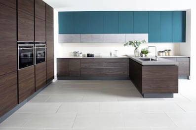
* Teal - psychedelic sixties (pictured): Bright and vibrant, this striking teal finish is representative of a decade where youth culture exploded and everything from fashion to interiors were full of psychedelic blasts of colour.
* Chamois - bohemian seventies: Comparable with its name, this earthy Chamois finish owes a natural nod to the bohemian spirit of the seventies - a time when political unrest was combatted by drawing inspiration from the soothing tones of nature.
* Powder - decadent eighties: With its soft, blush tone, this pale pink Powder finish offers a subtle salute to the most decadent era we've seen in the past 50 years, where chintz, pastel colours and shabby chic were all top of the pops in interior design.
* Taupe - minimalist nineties: Amongst the clash of pattern and florals, the nineties also brought with it a calmer, minimalist palette and introduced the UK to 'grunge' culture, both of which combine perfectly to create this neutral Taupe finish.
* Pale Navy - individualist noughties: Aligning with the expressive nature of the noughties, this Pale Navy finish pays homage to the modern-day trend for daring individual styling, from feature walls to bold colour bursts in every area of interior design.
With its fluid combination of colour trends from the past five decades, Burbidge's 150th anniversary colour palette resonates perfectly with the have-it-all, versatile attitude of the current 'tenties' decade. Each colour finish in this beautiful, soft palette offers the ability to mix and match perfectly to create the consumer's dream kitchen design, whatever their taste.
"We're very excited to release this new colour palette in celebration of our 150th year," says Ben Burbidge, managing director of Burbidge. "All colours are designed to be a reflective, modern take on the decades, that when put together, work in harmony to create one, beautiful palette that represents modern day trends.
"At Burbidge we pride ourselves on our design and style credentials and this exclusive colour collection draws on some of the greatest styles and cultural influences over the previous five decades. We're very proud of the success of the past 150 years at Burbidge and look forward to the next 150!"
10th March 2017


